The Color of the Year
The edgy-yet-nurturing green is part of the 2016 Odyssey color trends collection, representing consumers’ desire to embrace future-forward lifestyles while maintaining a thread of familiarity.
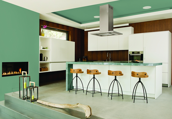
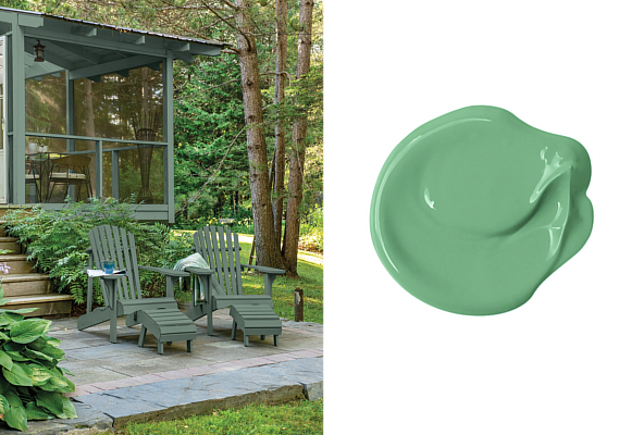
PPG The Voice of Color program by the PPG Paints and PPG Pittsburgh Paints brands named Paradise Found – a serious, aloe green – as its 2016 Color of the Year. The green is inspired by consumers’ search for security, protection, privacy and resilience in an uncertain world. As consumers look to embrace future-forward lifestyles and designs, color experts from PPG Industries, makers of PPG Paints and PPG Pittsburgh Paints products, anticipate Paradise Found will play a prominent role in home décor trends and styles, giving homeowners a silent guard and a sturdy, reassuring color for those wary of growing threats to global, national and cyber security.
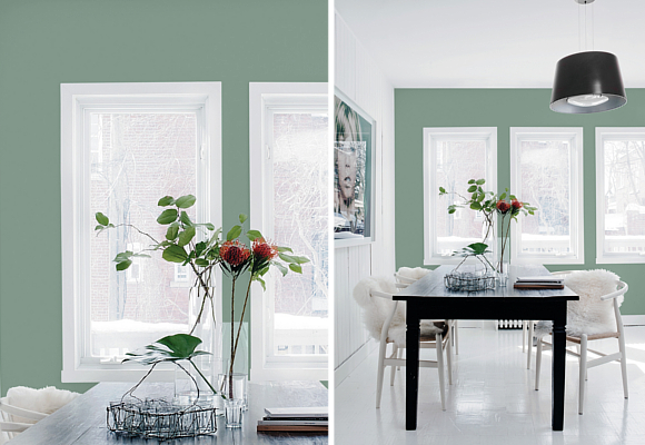
Paradise Found (PPG1135-5) is reminiscent of militia and natural environments and reflects our society’s increasing focus on the development of personal strength, safety and security. The muted green is sturdy and protective, providing consumers with a sense of familiarity, helping them feel more comfortable embracing change and newness and adapting their home décor with their evolving needs and lifestyles.
“An edgy-yet-comforting green like Paradise Found hints at nature while still touching on neutrality,” said Dee Schlotter, senior color marketing manager, PPG Architectural Coatings U.S. and Canada. “The 2016 Color of the Year provides the sense of strength, energy and comforting familiarity that consumers need to feel confident embracing newness and change. The color is also inspired by the runway, where we have seen a lot of urban militia styles.”
Paradise Found is one of the featured colors presented in Odyssey, a collection of four new color palettes showcasing the 2016 color trends from the PPG The Voice of Color program. The idea of adding newness to design styles from the past is evident in the four color palettes of the Odyssey collection, some of which were adapted from previous years’ color palettes and draw on references from the 1970s, while still representing a new direction and embracing change.
The 2016 Odyssey color palettes include: I/mPerfect, Hyper HD, Lucid Dreams and Knight’s Watch.